1. 캔들 차트 기본 설정
chart = createChart(chartContainerRef.current, {
  width: chartContainerRef.current.clientWidth,
  height: 500,
  layout: {
    background: { color: '#ffffff' },
    textColor: '#000'
  },
  timeScale: {
    timeVisible: true,
    secondsVisible: false,
    rightOffset: 3,
    barSpacing: 5
  },
  crosshair: {
    mode: 1,
    horzLine: { visible: true },
    vertLine: { visible: true }
  },
  grid: {
    vertLines: { color: '#eee' },
    horzLines: { color: '#eee' }
  }
});- barSpacing: 처음 화면에 보여지는 줌 정도 조절
- rightOffset: 오른쪽 여백 확보
2. 캔들 색상 설정
const candleSeries = chart.addCandlestickSeries({
  upColor: 'red',
  borderUpColor: 'red',
  wickUpColor: 'red',
  downColor: 'blue',
  borderDownColor: 'blue',
  wickDownColor: 'blue',
  priceLineVisible: false // 빨간 수평선 제거용
});- 상승은 빨간색, 하락은 파란색으로 설정 (국내 스타일)
3. 마지막 종가에 수평선 표시
const lastClose = ohlc[ohlc.length - 1]?.close;
if (lastClose !== undefined) {
  candleSeries.createPriceLine({
    price: lastClose,
    color: 'rgba(255, 0, 0, 0.4)',
    lineWidth: 1,
    lineStyle: 2, // 점선
    axisLabelVisible: true
  });
}
4. 거래량 히스토그램 위치 조정
const volumeSeries = chart.addHistogramSeries({
  color: '#b0c4de',
  priceFormat: { type: 'volume' },
  priceScaleId: 'volume',
  scaleMargins: { top: 0.7, bottom: 0 }
});

chart.priceScale('volume').applyOptions({
  scaleMargins: {
    top: 0.85,
    bottom: 0
  }
});- 상단과 차트 영역 간 여백 조정
5. 이동 평균선 표시 (MA5, MA10, MA20)
const ma5Series = chart.addLineSeries({ color: 'green', priceLineVisible: false });
const ma10Series = chart.addLineSeries({ color: 'gray', priceLineVisible: false });
const ma20Series = chart.addLineSeries({ color: 'gold', priceLineVisible: false });- priceLineVisible: false 로 우측 레이블 제거
- MA 선 위에 마우스 올렸을 때 생기던 동그란 점도 안 생김
6. 우측 숫자 포맷 조정
chart.priceScale('right').applyOptions({
  mode: 1,
  autoScale: true,
  format: (price) => {
    return Number(price).toLocaleString('ko-KR', {
      maximumFractionDigits: 0
    });
  }
});- maximumFractionDigits: 0 → 소수점 제거
- toLocaleString → 콤마 표시
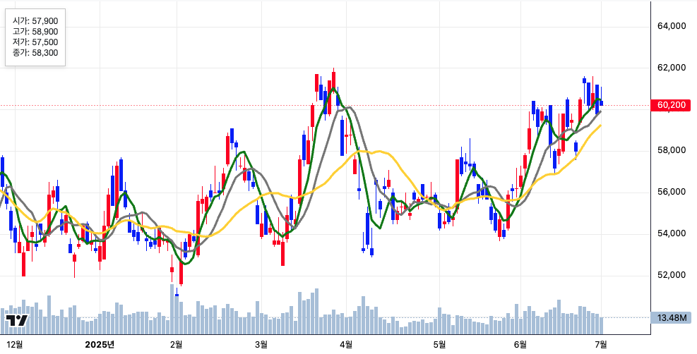
7. 툴팁 커스터마이징
chart.subscribeCrosshairMove(param => {
  if (param.time && param.seriesData) {
    const candle = param.seriesData.get(candleSeries);
    if (candle) {
      setTooltipData(candle);
    } else {
      setTooltipData(null);
    }
  }
});
{tooltipData && (
<div style={{ position: 'absolute', top: 0, left: 0, background: '#fff', padding: '10px', fontSize: '12px', border: '1px solid #ccc' }}>
<div>시가: {tooltipData.open.toLocaleString()}</div>
<div>고가: {tooltipData.high.toLocaleString()}</div>
<div>저가: {tooltipData.low.toLocaleString()}</div>
<div>종가: {tooltipData.close.toLocaleString()}</div>
</div>
)}- toLocaleString() 으로 숫자 포맷 개선
- 툴팁은 캔들에 마우스를 올렸을 때만 표시됨
8. MA 라인 위 동그란 포인트 제거
// priceLineVisible: false
// tooltipData에 candle만 사용함 (MA는 subscribe에 포함되지 않음)
9. 캔들 차트에 따라 붙는 붉은색 박스 제거
priceLineVisible: false- addCandlestickSeries 설정에서 제거
이렇게 구성하면 한국 스타일에 맞게 심플하고 직관적인 차트를 만들 수 있습니다.